Here are my picks for best movie posters for 2007 so far. I am always paying extra attention to posters and how they attract attention. Sometimes, a well developed marketing campaign can make even a crappy movie look interesting, or a great one all that much better. The choices I picked have some films I've seen and some that I haven't. Though they all are memorable for some reason.
So here they are:
10. Aqua Teen Hunger Force The Movie:

Just the fact that it looks like more time and effort has gone into this poster than the movie itself gets it an A in my book. I haven't seen the movie and I'm not a huge fan of the show, but the art is quite incredible.
9. Gone Baby Gone:

Another film I have yet to see, but was able to get my attention from the poster alone. The idea is simple, but the subtle use of different font and layout, along with beautiful graphic, makes this one memorable for me.
8. Black Snake Moan:

This is one film I did see but did not enjoy. It is a testament to the power of advertising. I had high hopes for this film based almost solely on the poster alone. The old comic book style and B-Movie appeal is excellent.
7. Grindhouse:
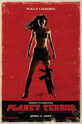
Another poster with great use of deterioration technique to give it an aged retro look. Luckily, the film managed to live up to the poster's promise. The sexy gun-legged heroine is an unforgettable image to say the least. Who could walk by this poster on the street and not take a second look?
6. American Gangster:
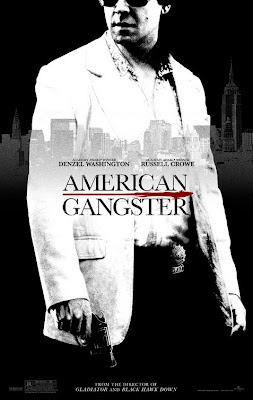
This film hasn't even come out yet, but I'm liking the posters for it very much so far. I like the simple black and white colors and the cityscape adorning the center. This one just works for me.
5. Shoot Em' Up:
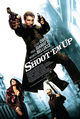
This movie was great and the posters released were just as good. This one, combining all the main characters in one, is just a great eye-catcher. I especially like the unconventional use of text, which makes for a unique piece.
4. Knocked-Up:
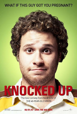
This poster continues the clever idea that the 40 Year Old Virgin employed in its posters by using the main star as the main focus and showing them an an awkward pose. This time it's Seth Rogan looking particularly un-movie star like, and it couldn't be any better.
3. Smokin' Aces:
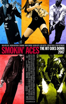
I'm slightly biased towards this movie and the posters for it, but I really dig the style of this poster in general. I like the use of colors, the placement of the characters and how their not fully revealed, and the use of the sideways text.
2. 28 Weeks Later:
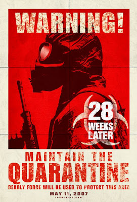
This poster is very effective, and if it weren't for the logo adorning it, you'd think you were in some sort of immediate danger for real. Ok maybe not, but it is certainly kick-ass. Another great use of the worn-out look.
1. 3:10 To Yuma:
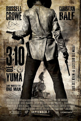
I'm not sure why I always come back to this poster, but I just think it's one of the best I've seen in a long while. It was unfortunately replaced by a far more generic one in theaters though. I like the fact that despite the movie having some big stars, you don't see any of their faces in it. It also looks really dirty and grungy, just like a poster for a western should be.


